
Chapter 2 - Proximity
Proximity.
Proximity is the principle of taking related items, and putting them together so that they are seen as a group, and is used to create a sense of organization. Items not related should have space between them so they are not seen as a group. Physically showing space, and boundary between items of no relation helps people see that they are not related, and treat them as such. It also makes the information more accessible to the reader.
Ex.1

In this one all the information is jumbled and thrown across the page. You can't really tell what they are selling, and the address is the same font as what they are selling.
Ex.2

In this one all of the information that is related is within proximity of each other, The address and date, are with the title, at the top of the poster. Everything being sold is in the middle next to each other. And where the proceeds, and the free coffee and donuts are at the bottom. The "Free coffee and donuts!" at the bottom are not with the things in the middle because it is free and not being sold, you can tell this because it is not with them.
What to avoid.
Avoid too many separate elements on the page.
Don't stick things in the middle, and in the corners.
Avoid leaving equal amounts of white space between elements unless each group is part of a subset.
Avoid confusing readers.
Don't create a relationship between elements that don't belong together.
Chamber Concert Series
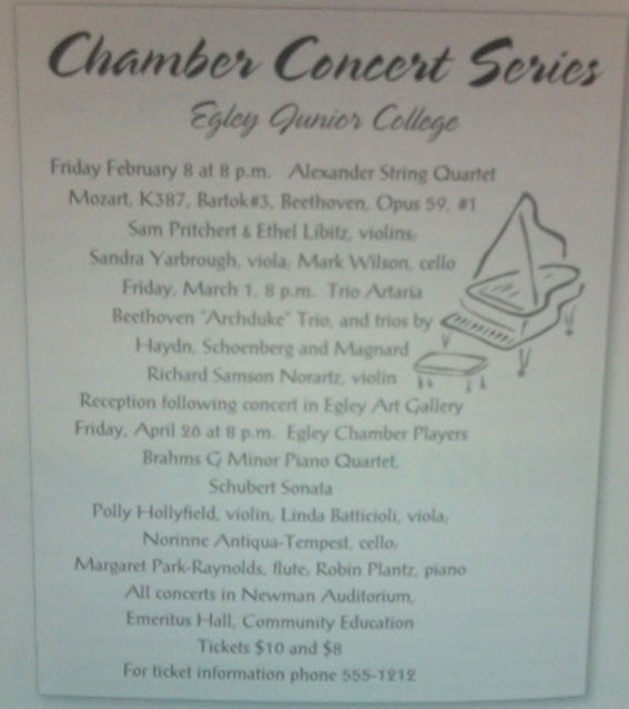
In this photo, the poster is cluttered and you get the idea that everything is related, when it isn't. and theres no difference in font, or anything bolded, except the title, to tell you that something is important.
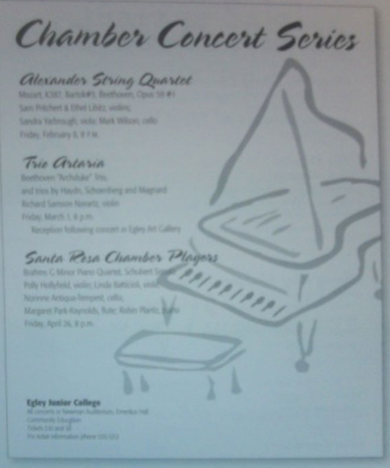
In this one the concerts are no longer just one giant pile of text, but have context, and the heading for the concerts are a different font, and the information of that concert is under the correct header.The contact info, and ticket prices are grouped at the bottom. And the picture of the piano is enlarged, to draw attention to it.